Overview
I designed and developed a social “meet-up” style application based on wireframes. The app would pinpoint adventure and fitness-minded individuals and enable such users to meet, plan, and attend local outdoor activities.
Challenge
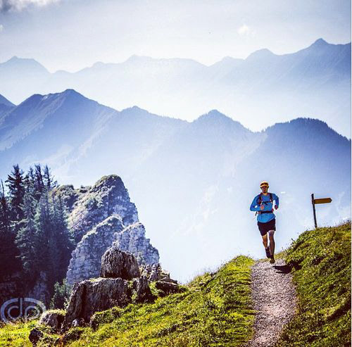
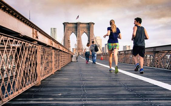
There are limited applications that allow outdoor fitness enthusiasts to “meet-up” for organized runs, races, and outdoor events.
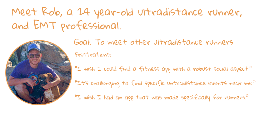
Persona
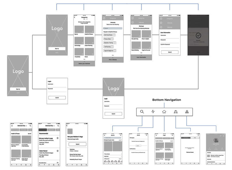
Wireframe Analysis
I analyzed a series of wireframes. I looked at the user flow and navigational components. Was there anything that could be changed or modified to improve flow and engagement? My role was to implement engaging UI components, graphics, photography, color palette, and a workable font hierarchy.
The ultimate goal was to end up with a unique and dynamic social meet-up app for the outdoor community.
Approach
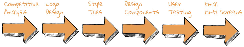
Competitive Analysis
Key takeaways
Competitors had simple and inviting color schemes with intuitive navigational components. The content was easily digestible with the ability to share/personalize content.
Surprising and Interesting
You can send out customized invites, but the social aspect is missing and limited functionality and content. Users want the ability to streamline events, meetings, and socializing in one app. Several apps or websites seemed to be useful at organizing work meetings, events, or parties.
Design Goals
I would create an app that could store events, organize meet-ups, and attend activities. The app should have a personalized approach and explicitly target users in the outdoor enthusiast space. The layout should be simple, with graphics and imagery that portray an outdoorsy vibe. Fonts should be readable and inviting.

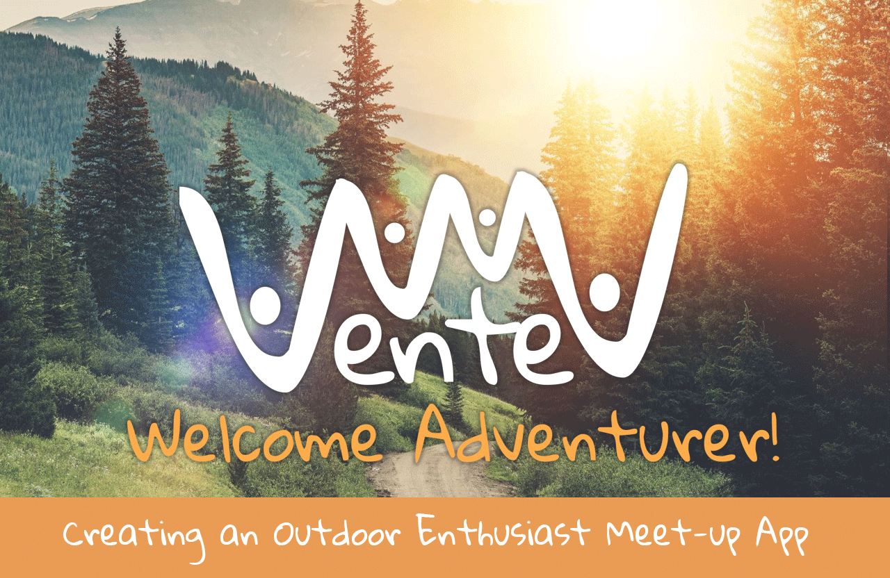
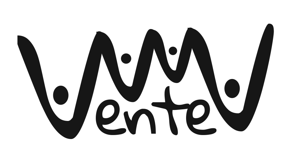
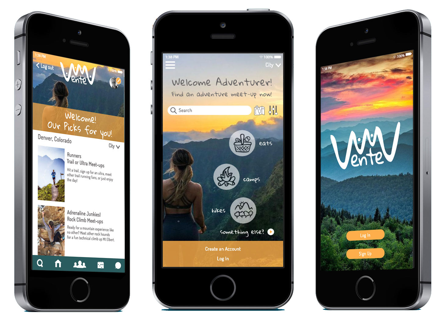
Logo Design
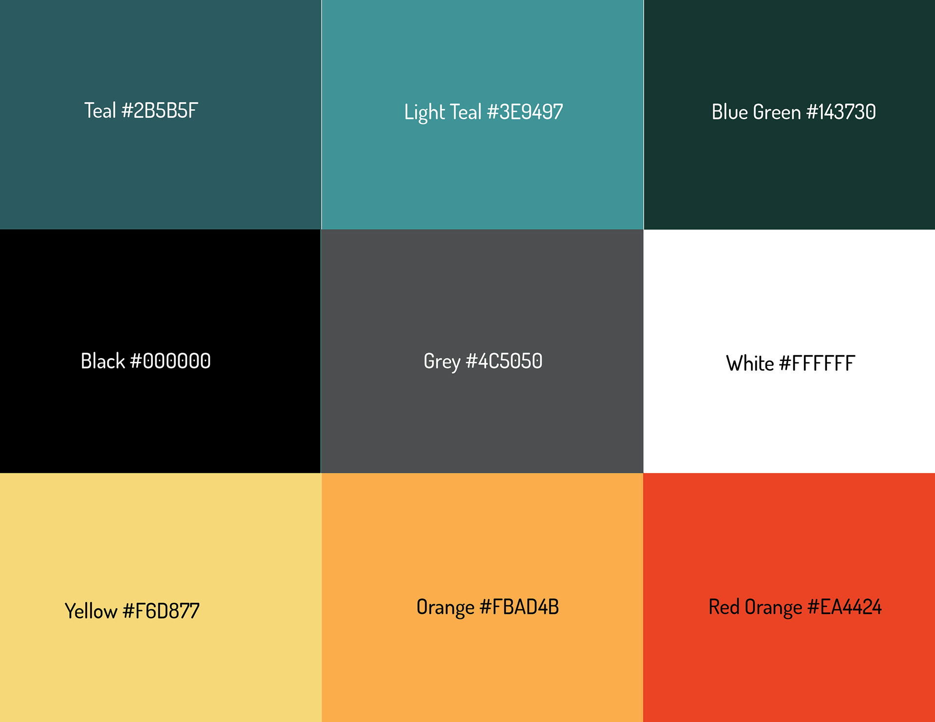
I designed and developed a new logo that more closely represented the Vente brand. I came up with a mountain theme that also reflected the social aspect of Vente. The multiple letters “V’s” create mountain peaks; the small circular elements represent people and the sun. The peaks connect but also act as outstretched arms lifted and connecting. The mountain theme uses bright colors that include orange and turquoise.
These colors represent what you would find in nature.

Style Tiles
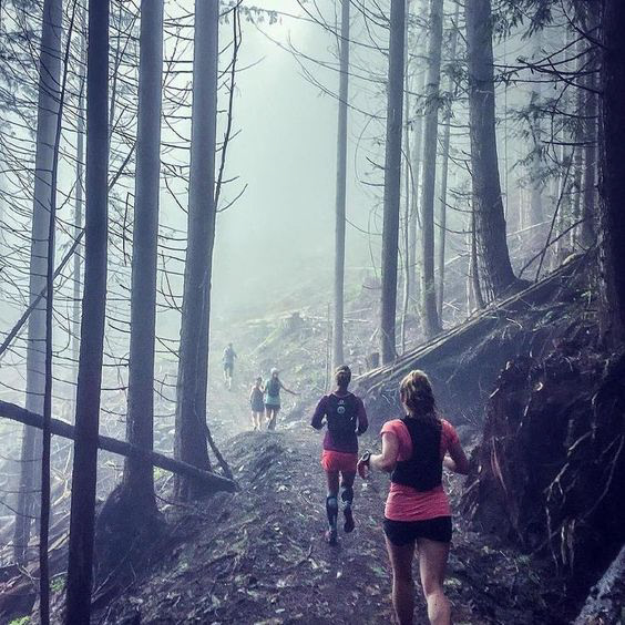
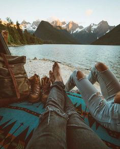
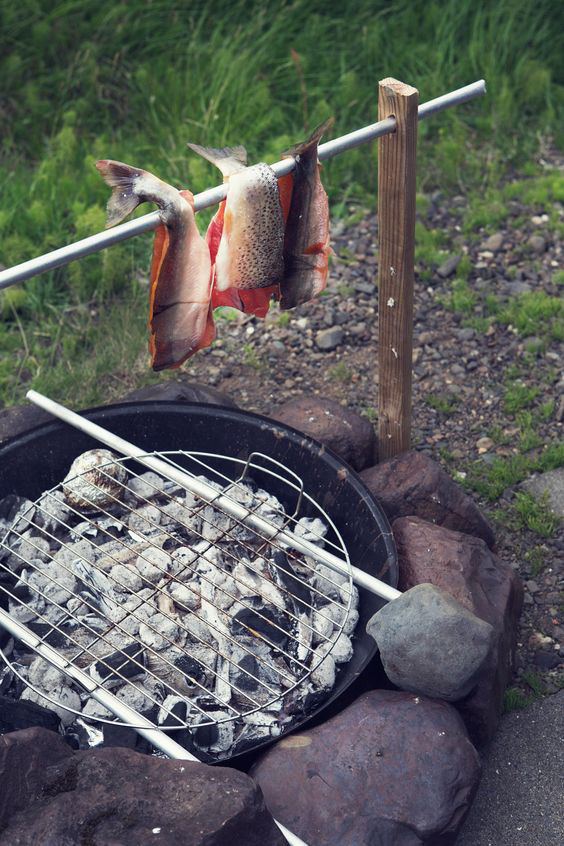
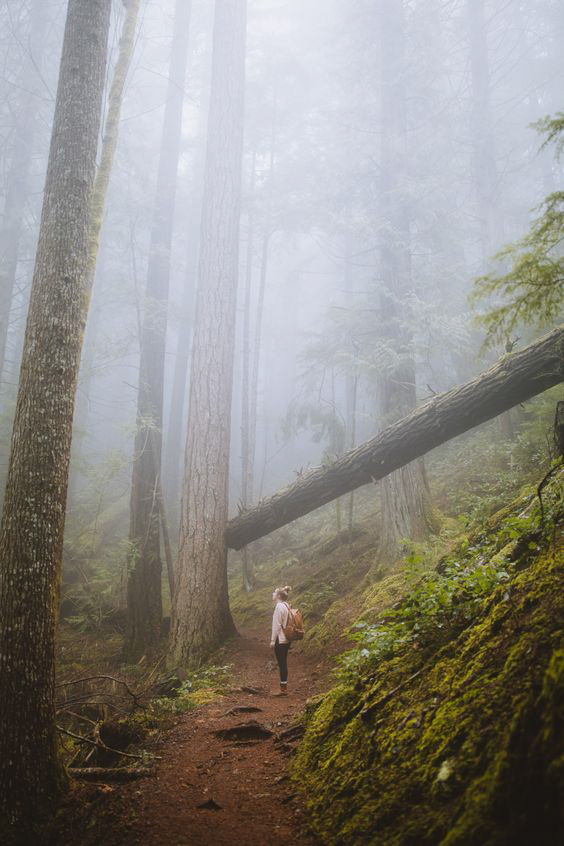
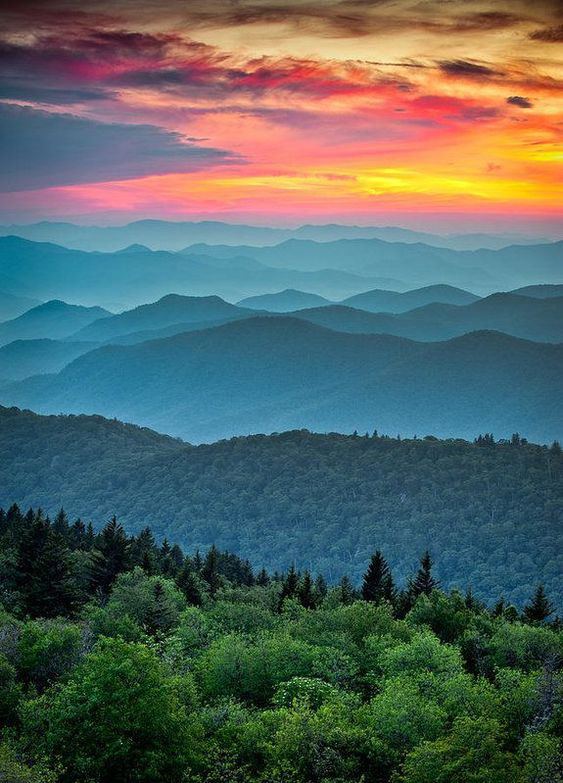
The preliminary Style tiles were based on several Moodboards created to experiment with various color themes, font styles, and a general mood or feeling. The Moodboards represented beautiful earthy colors and imagery that consisted of browns, greens, blues, and yellows. Eventually, these colors expanded to include orange and turquoise with logo variations.
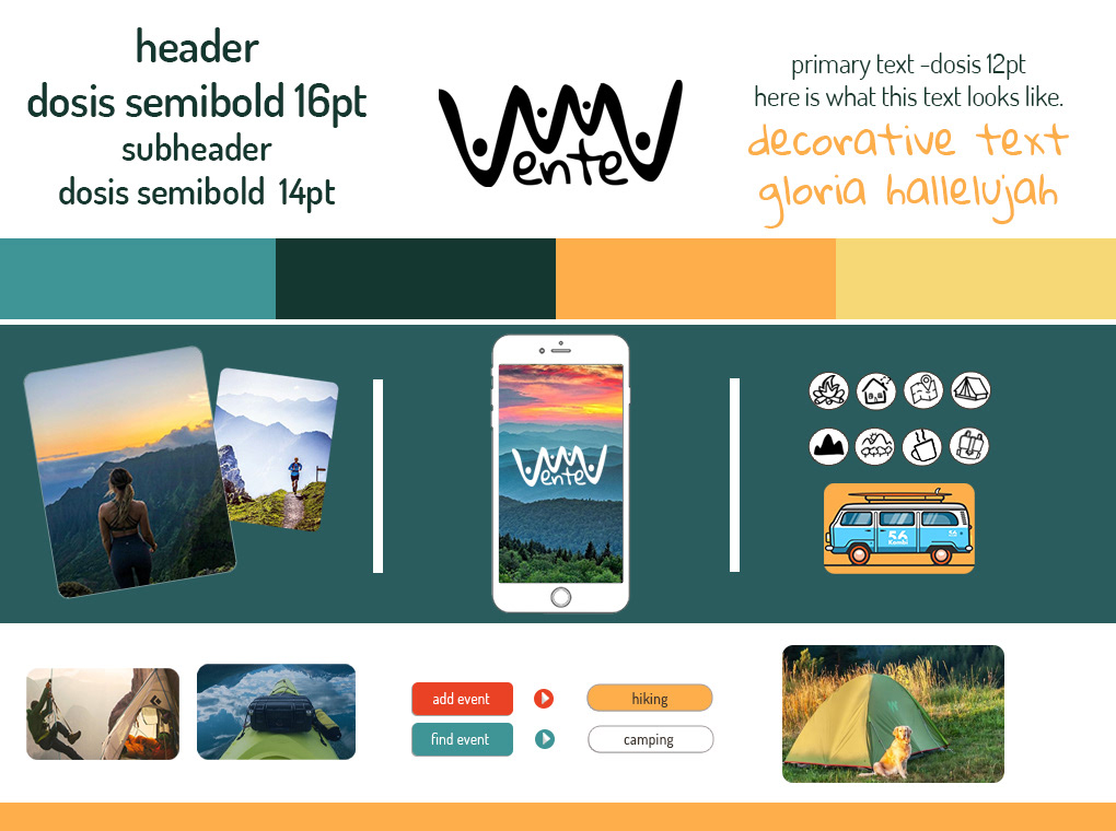
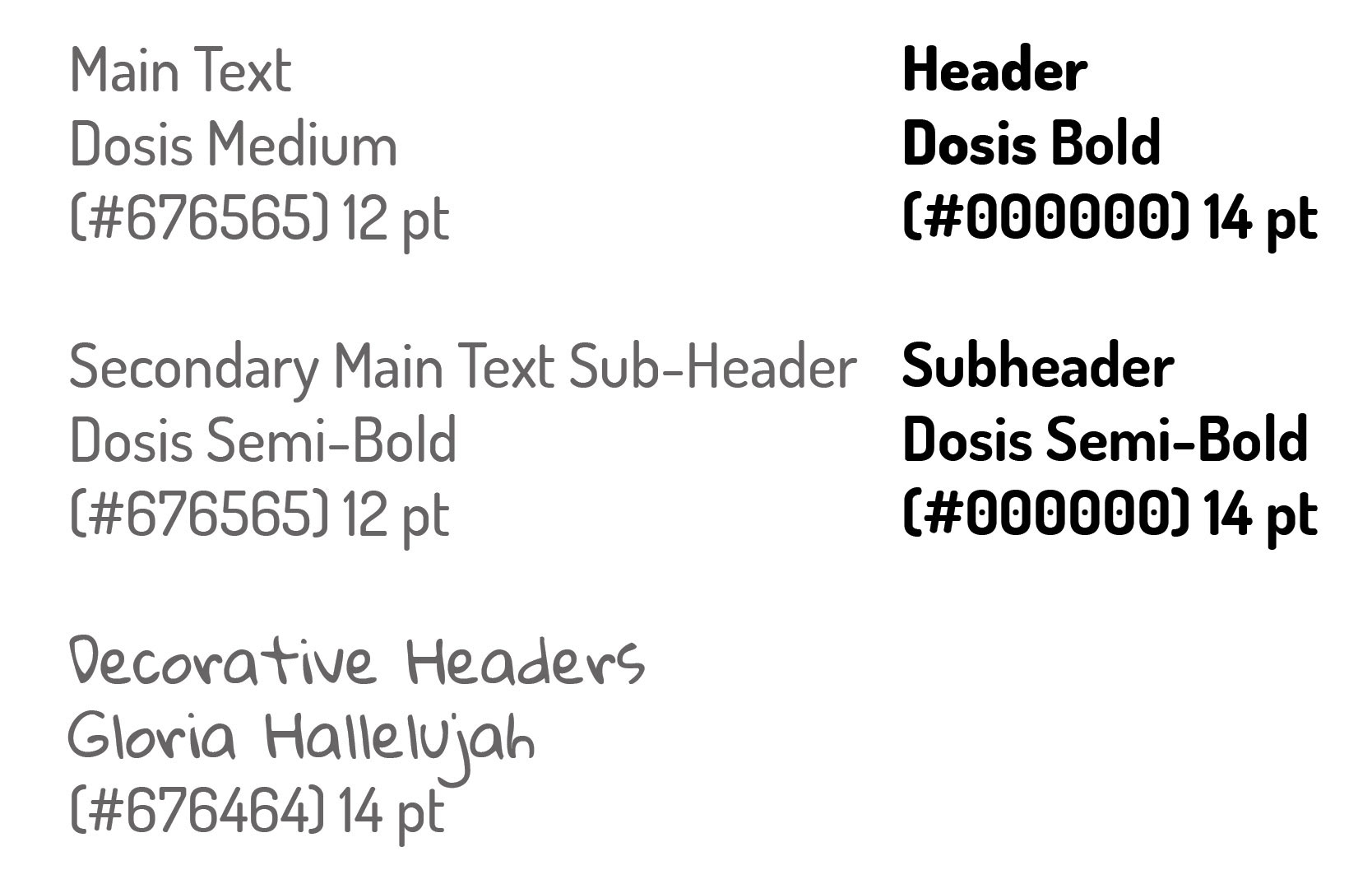
The brighter colors represented beautiful sunsets and sunrises that you would experience while being in nature, camping, hiking, and surrounded by green mountains and trails. The font choices of Dosis and Gloria Hallelujah provide ease of readability along with a fun outdoorsy vibe.
Design Components
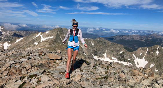
Imagery and Photographic Elements


Color Palette
Typographical Elements
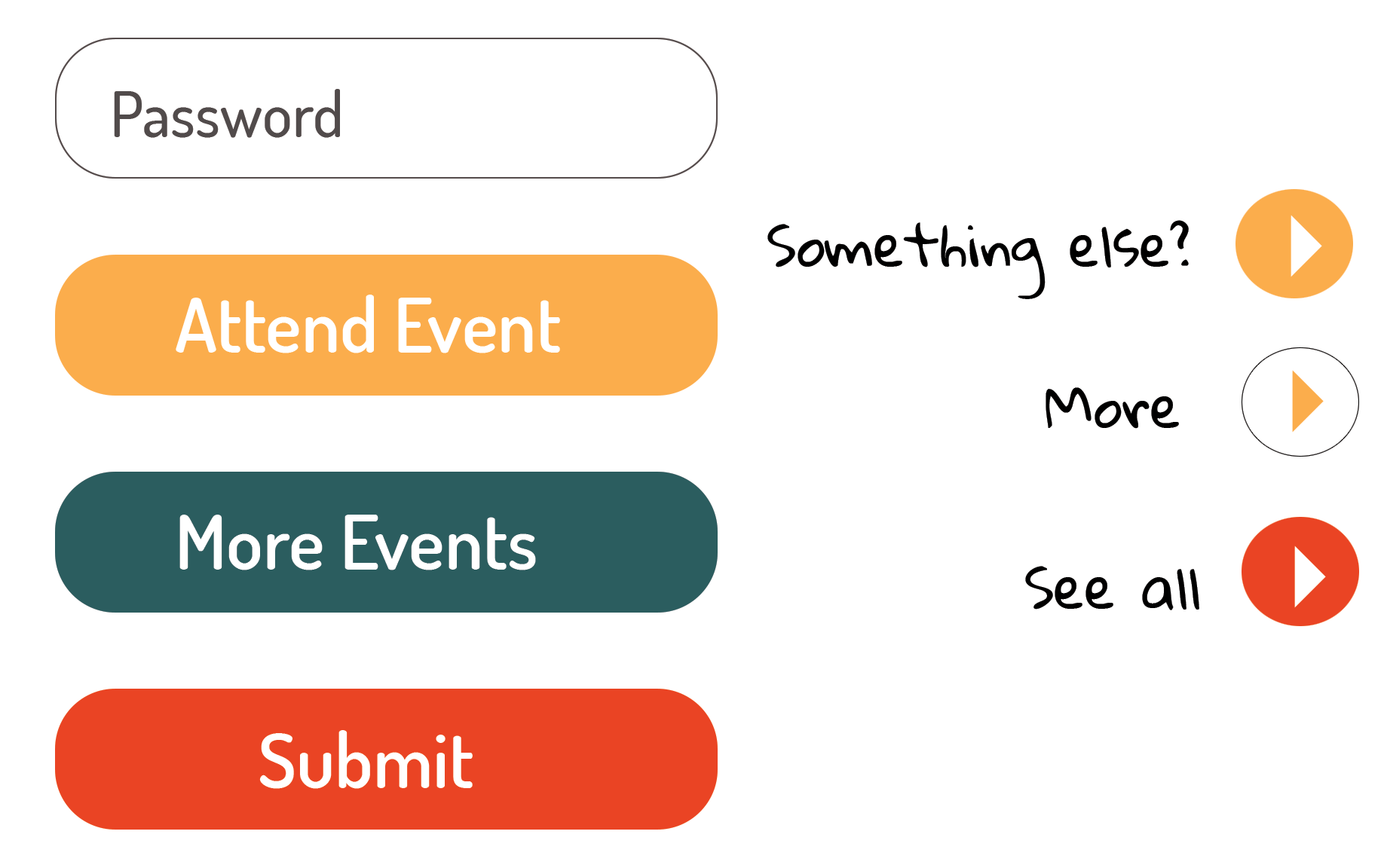
UI Components
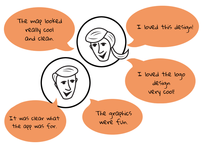
User Testing
The first set of hi-fi screens went through a series of usability testing. The feedback was then taken and used to iterate a second set of final hi-fi screens.
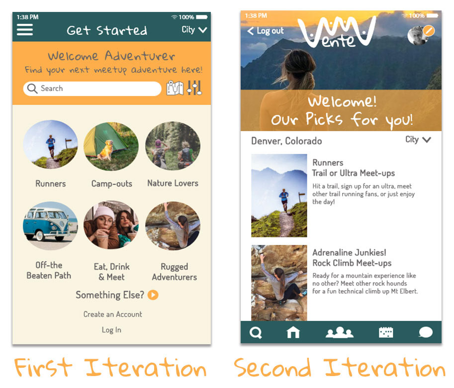
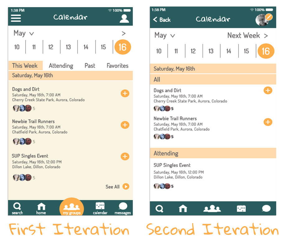
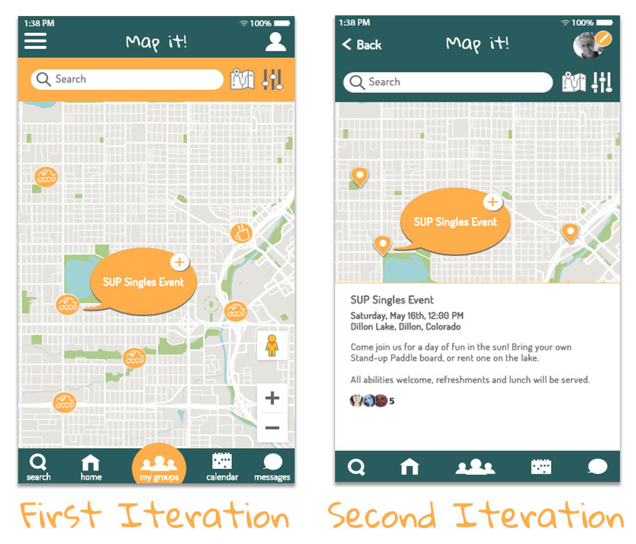
The original iteration utilized a light yellow background, which changed to white because of accessibility—the white made for ease of readability. The splash and log-on screens (two iterations) enabled an enhanced user flow and gave the app a beautiful vibe. I also simplified the bottom navigation. The mapping function expanded the ability to provide more details to saved events.
Final Hi-Fi Screens
When I developed the Hi-Fidelity screens, I encountered a few challenges after receiving feedback on the Style Tiles. While the icons used in the Style Tiles were exciting and fun, they did not translate well into something intuitive. On top of that, I modified the imagery to align better with the new color scheme.
Below is the user flow for attending an event:
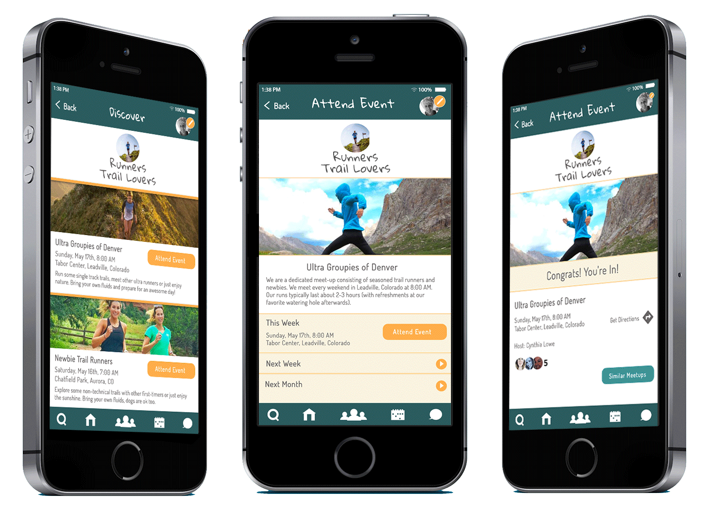
I added a group function, store, watch, or find recommendations via the group page. Additional category pages to add events to your watchlist helped user flow and streamlined the personalization process.
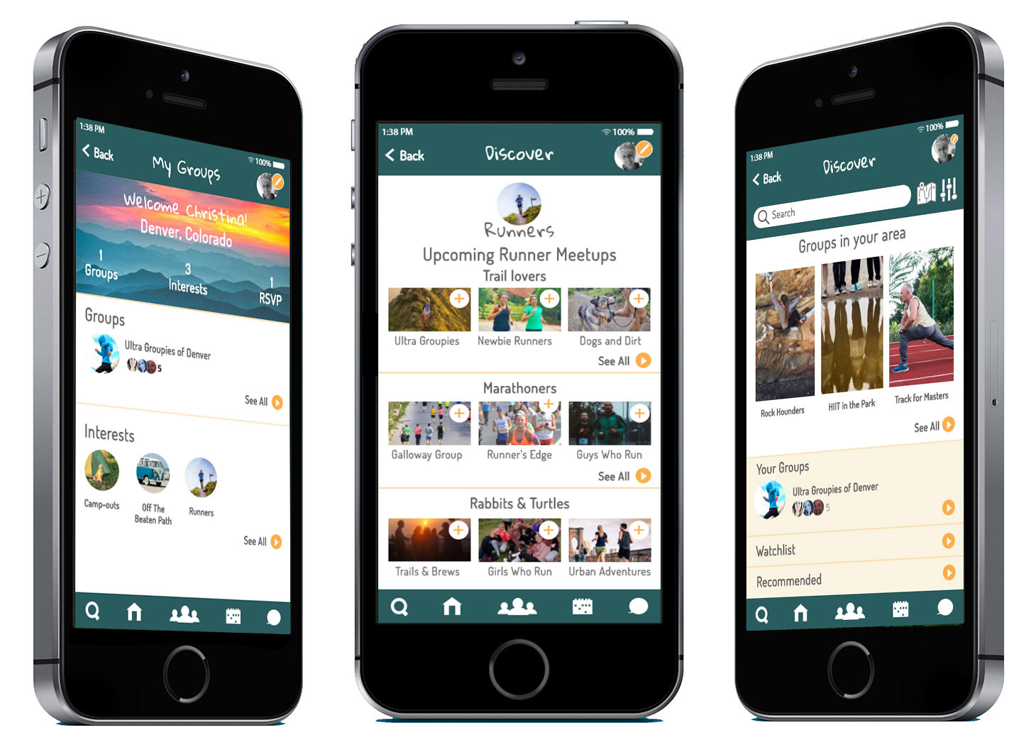
An interactive mapping component with the ability to provide descriptors was added. A calendar function was also added. The calendar and mapping component would allow users the ease of storing locations and finding locations for saved events.