Our team was tasked to build high fidelity visual interface designs for Tailoru, a custom clothing marketplace.
Who and what is Tailoru?
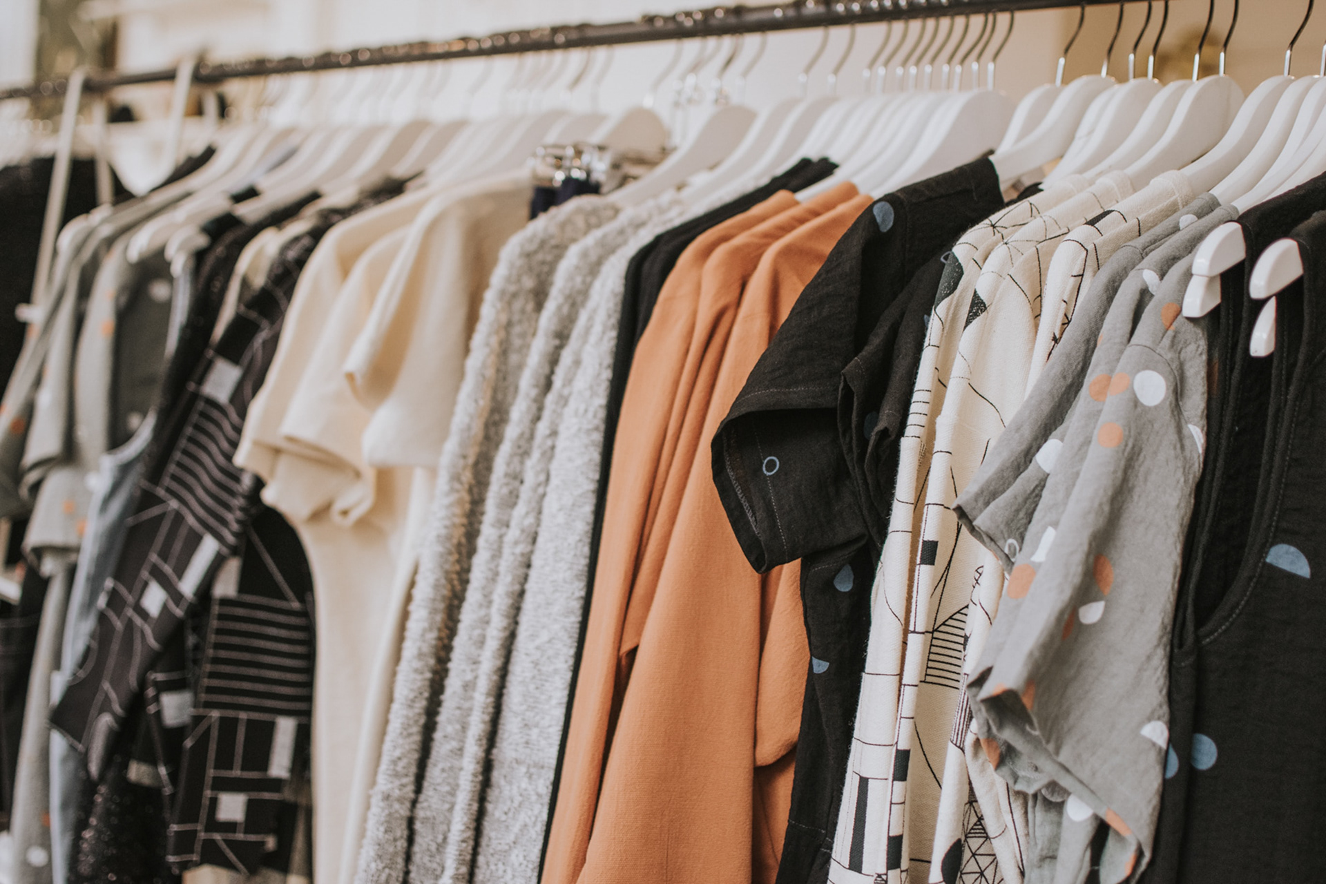
Tailoru is a small company that provides a one-of-a-kind, unique clothing experience for customers. The visual interface designs would be part of their onboarding component. This component (app) would enable users to choose clothing options by connecting directly with "Makers" and get unique made-to-fit custom clothing or accessories.
Challenge
How do we create a dynamic application which pairs clothing designers with customers who want custom clothing creations?
We met with the client to discuss goals and share ideas (feedback). She explained that there were already a set of wireframes developed by a team of UX designers.
Our goal was to expand upon those wireframes by implementing a dynamic color scheme, font style, and unique UI components that were inclusive to a global community.

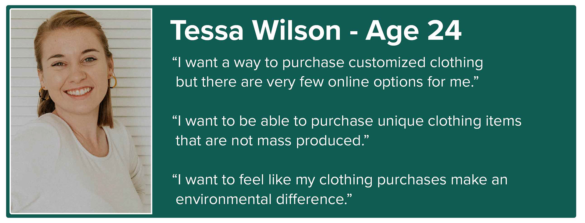
Persona
Who was our audience?
Our shopper would be between the ages of 24 to 54 and generally female but could also include males, or other gender associations. They love unique styles, and connecting with stories (Instagram and/or Etsy). They are environmentally conscious (ethical/sustainable buying practices). They generally are mid to high income or have come from a country where tailoring was part of life.
Approach
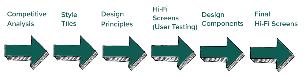
Competitive Analysis
The first part of the development process required a competitive analysis which examined 6 direct and 2 indirect competitors in order to better understand the marketplace for such a platform.
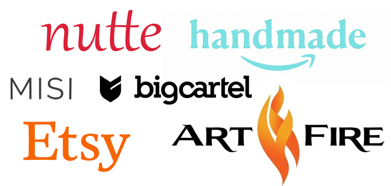
Key Takeaways
The competitors had natural muted and simple color schemes (green, blue, black) with intuitive user flow and navigational systems. The use of beautiful photography created a more "artistic" and creative theme for these competitors. Font systems were simple sans serif, providing ease of readability. The apps were clean and UI components were surrounded by a good amount of white space.
They provided a unique space for artists and craft persons to sell and market their products for a small fee.
What could they improve upon?
Some of the competitors were difficult to find and had little to no mobile presence (Nutte, Big Cartel) with limited product. The spaces did not feel personal, and only one competitor (handmade) had a more personalized feel with artist stories and customization.
Design Goals
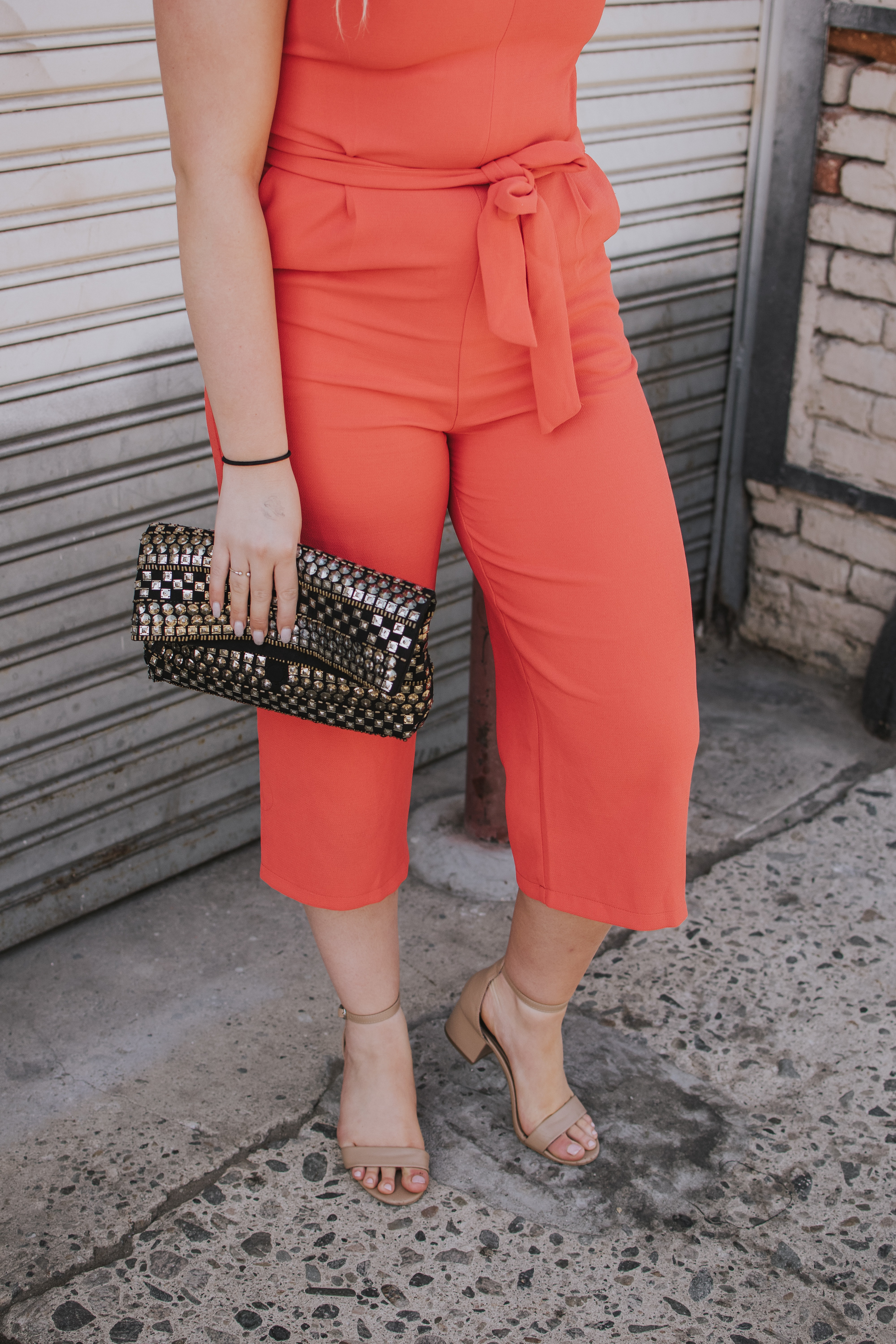
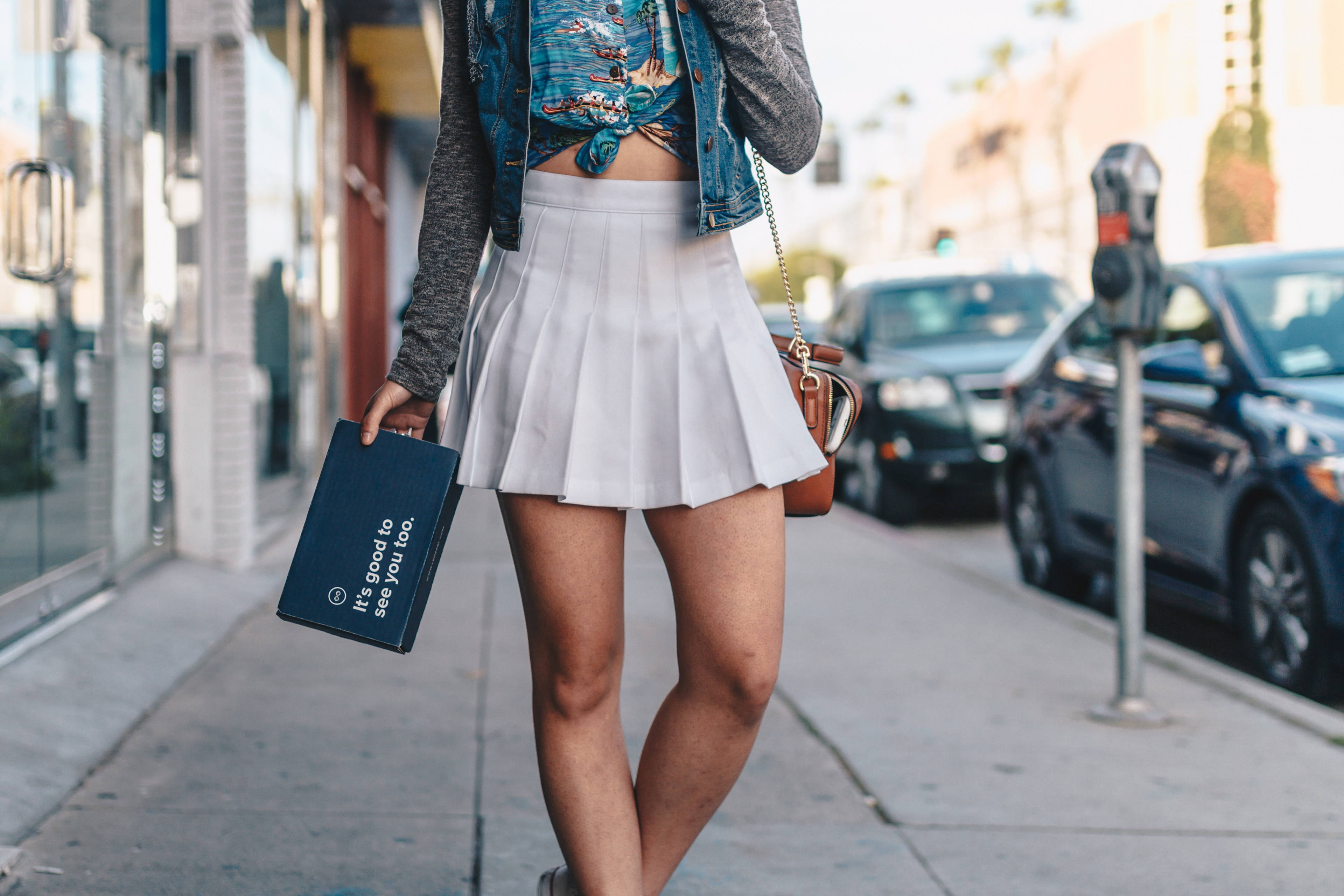
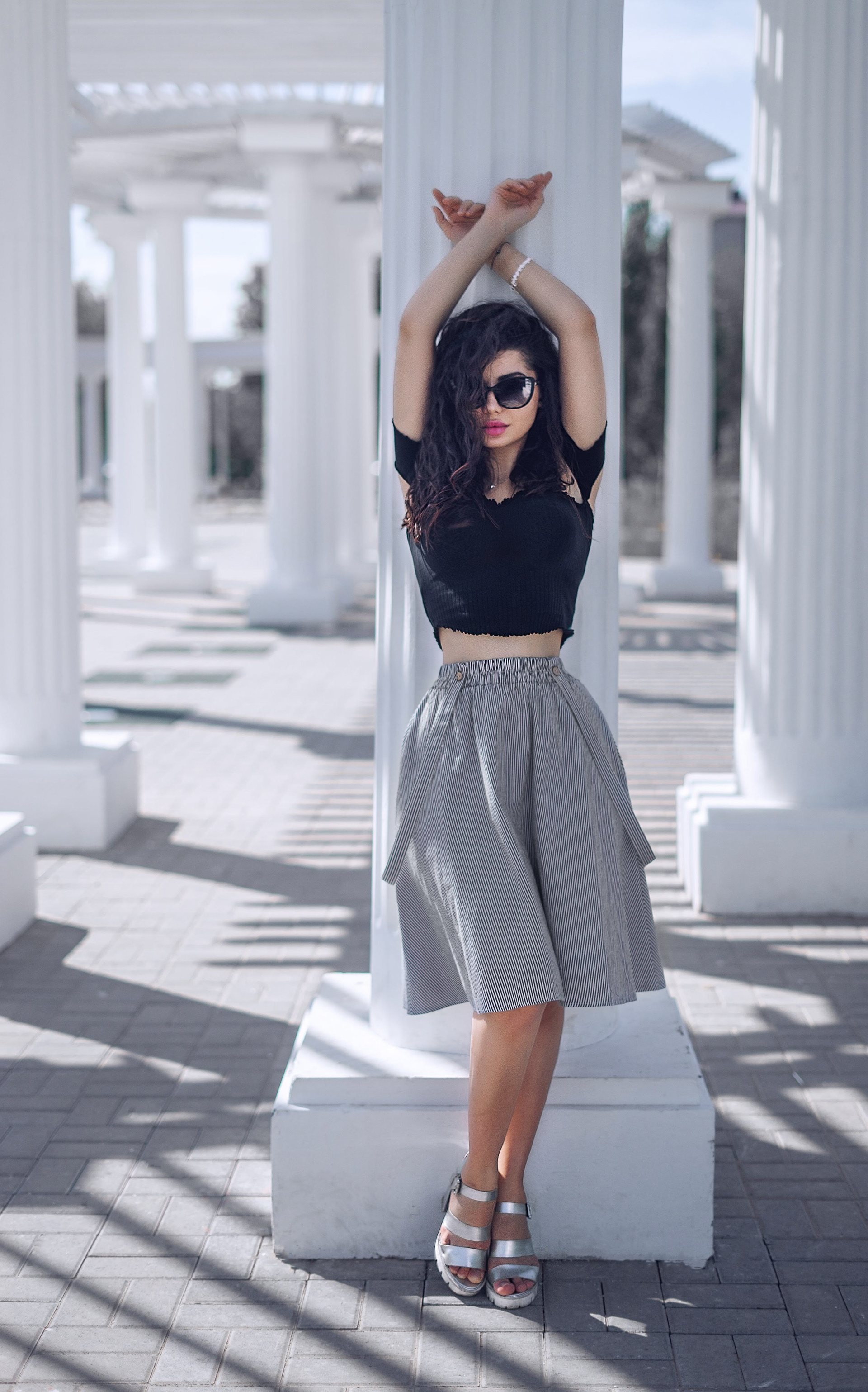
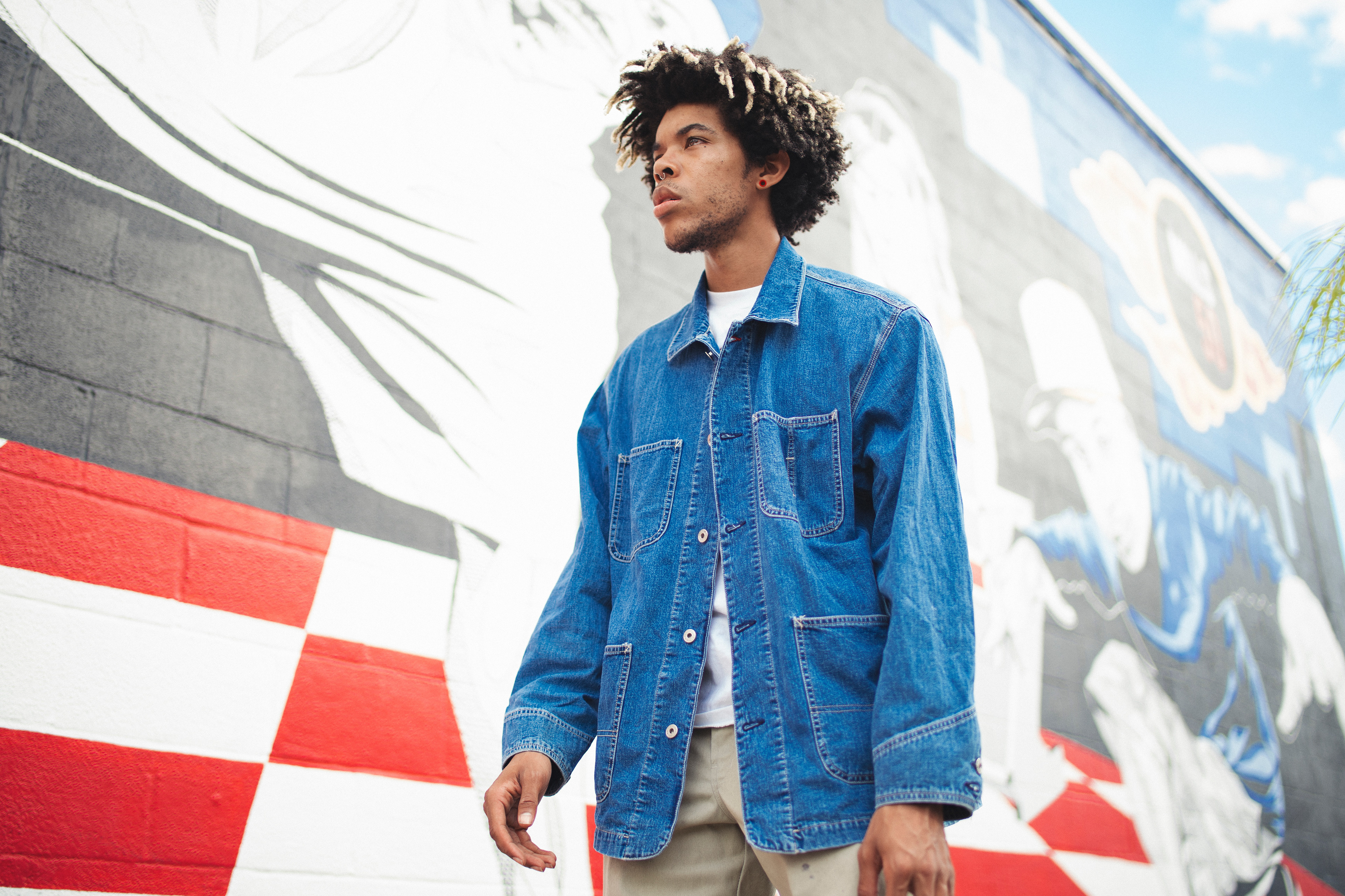
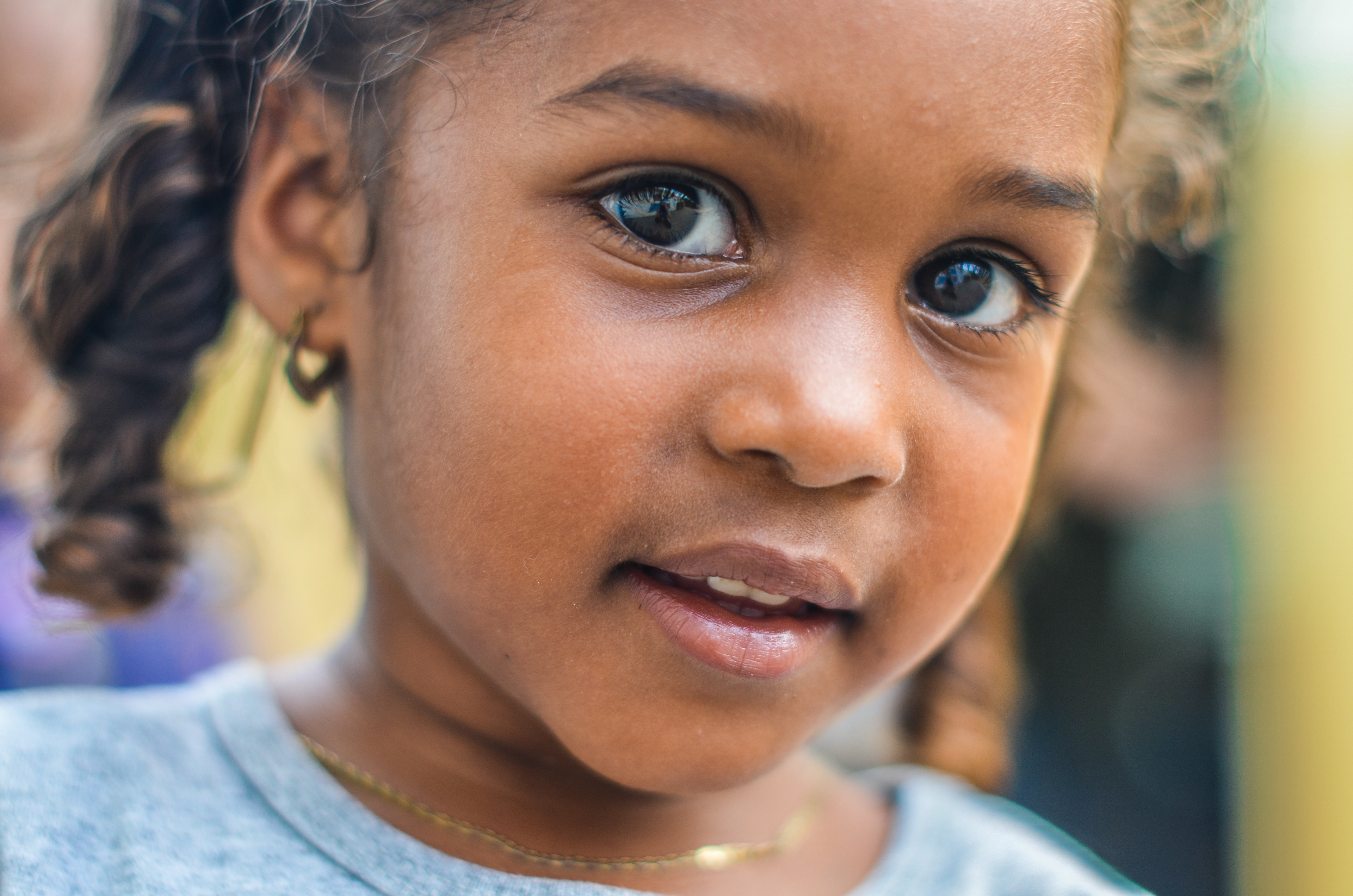
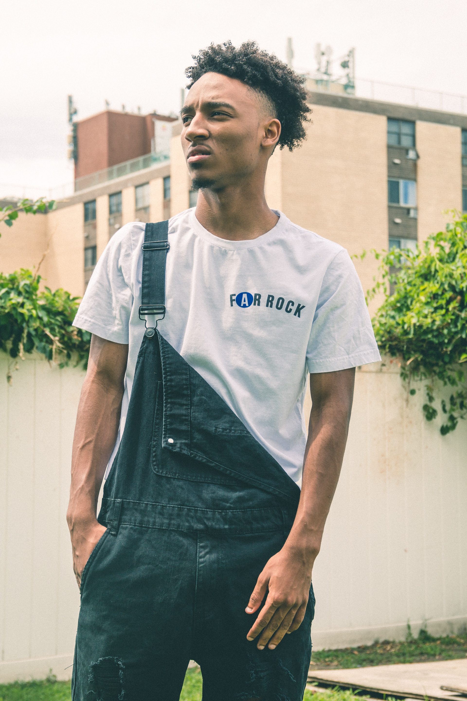
To create a unique space where vendors (artists) could connect with customers and the community. The app should portray an artistic and creative component. My goal was to visually incorporate that creative feel with a bright and vibrant palette. Our competitors had specific UI components, buttons, and cards that were large and combined beautiful imagery and photographic elements. I decided to focus on how I wanted to replicate that as well. I chose unique and bold photographic features for my design.
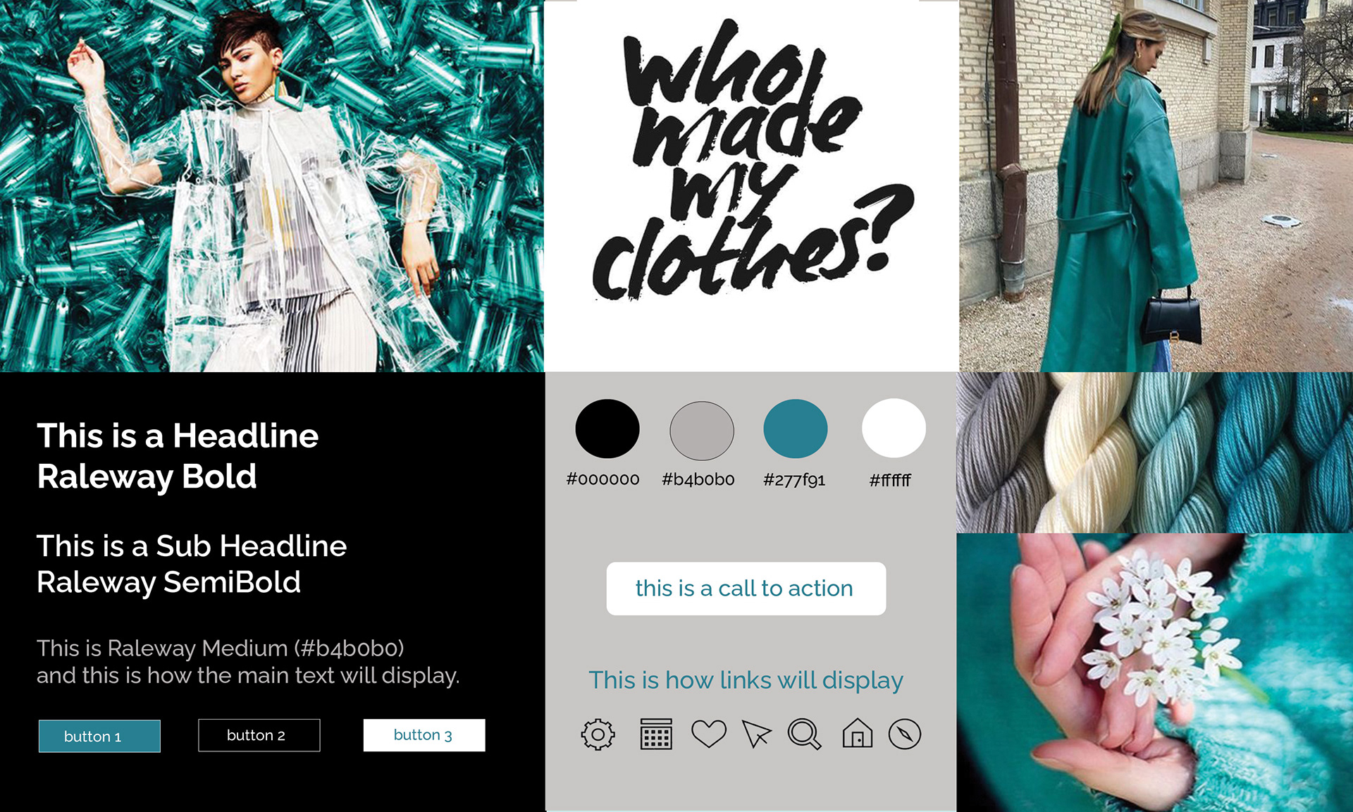
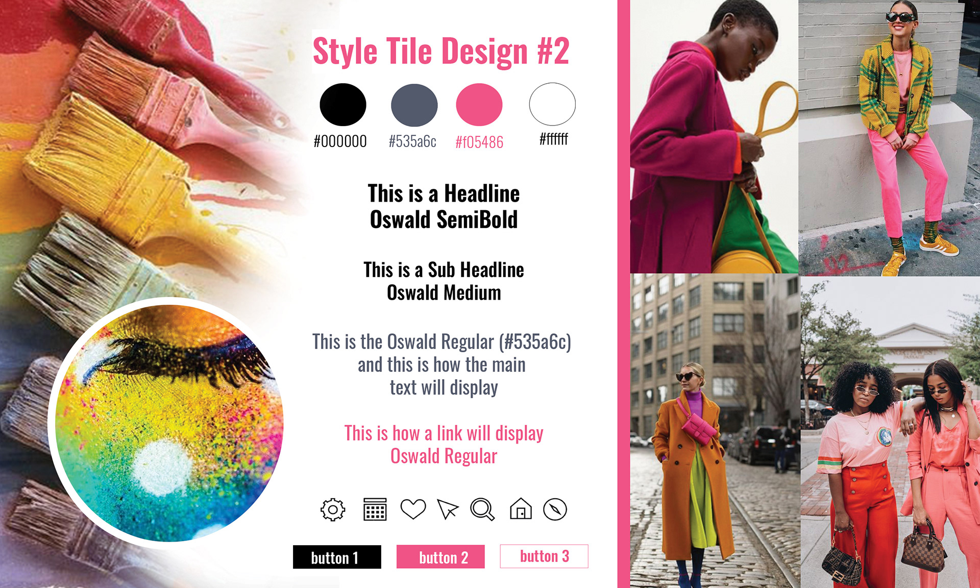
Style Tiles
I created two divergent style tiles to show the client. One style was chosen from the initial two to use as a final prototype for additional user testing. From those style tiles I was able to flesh out the hi-fi screens and then (based on user feedback) finalize a set of design components for the client.
Design Principles
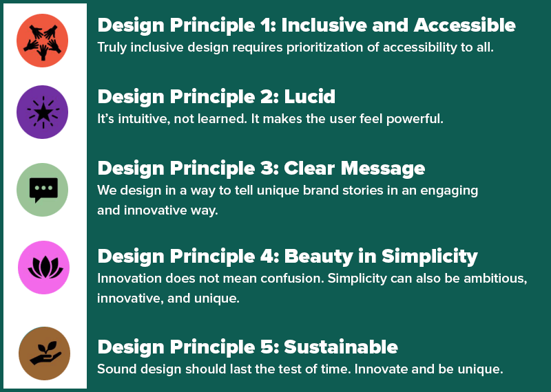
I developed a set of Design Principles that provided the most meaningful impact on my approach. These principles would establish a specific set of standards and values for the design process.
All designs would embody these principles moving forward.
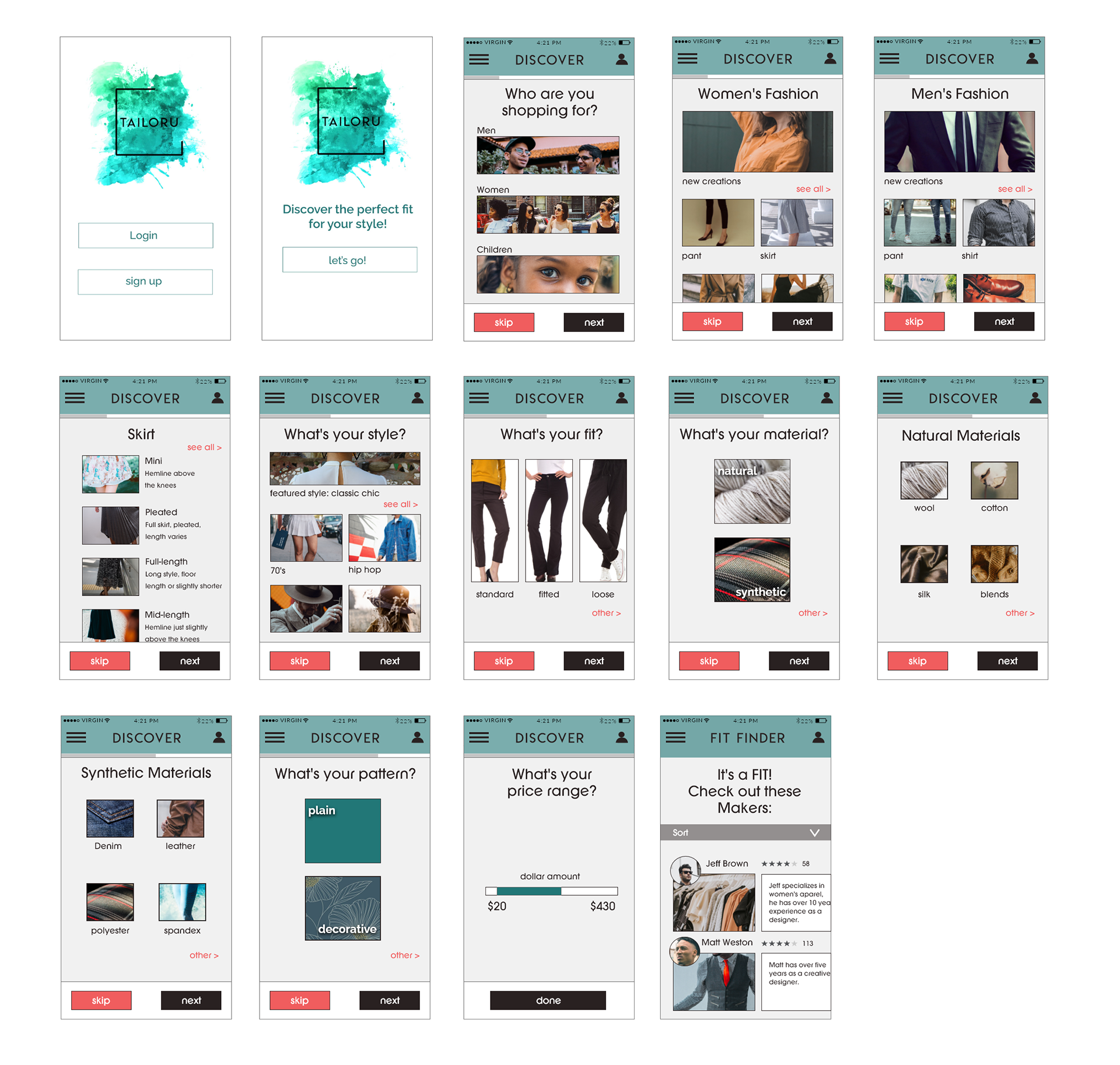
Hi-Fi Screens (user testing)
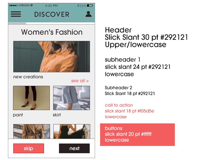
I started with six screens, based on the onboarding aspect of the application (choosing clothing, style, fit, materials, etc.). I created these screens using the palette implemented from my initial style tiles. The bright colors focused on the creative aspect of clothing design. A simple handwritten sans serif font style that matched the creative element was also chosen.
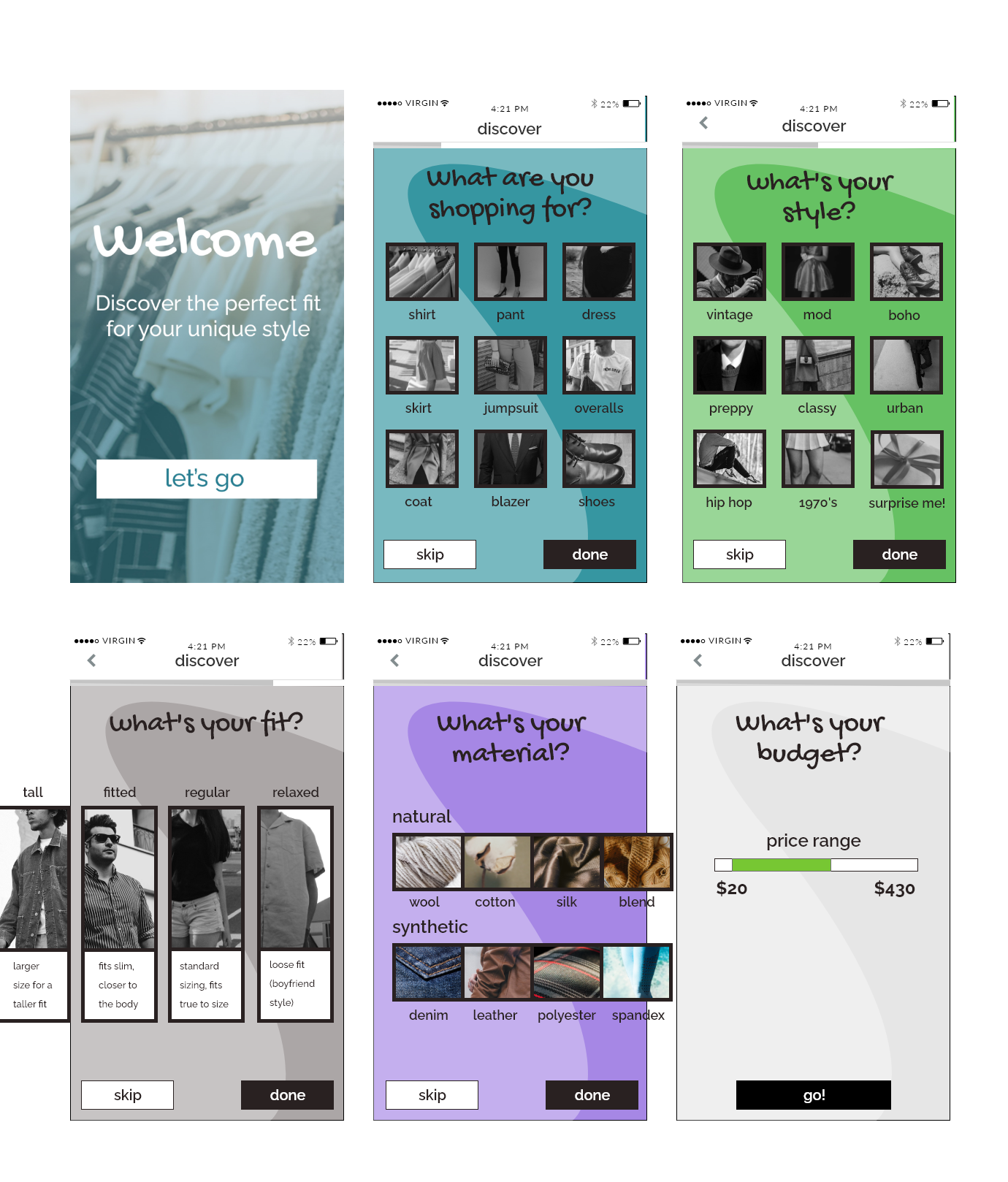
Users loved the colors, specifically the teal, but thought that they were a bit distracting and took away from the application's overall purpose, so I changed the colors. I also updated the font styles. With the second iteration, users wanted to see more options regarding clothing choices, materials, style, and fit. I implemented additional screens to assist with user flow.
Design Components
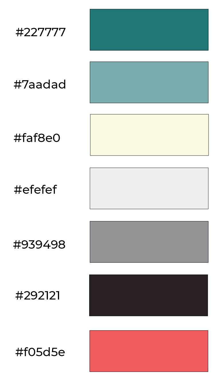
Color Palette
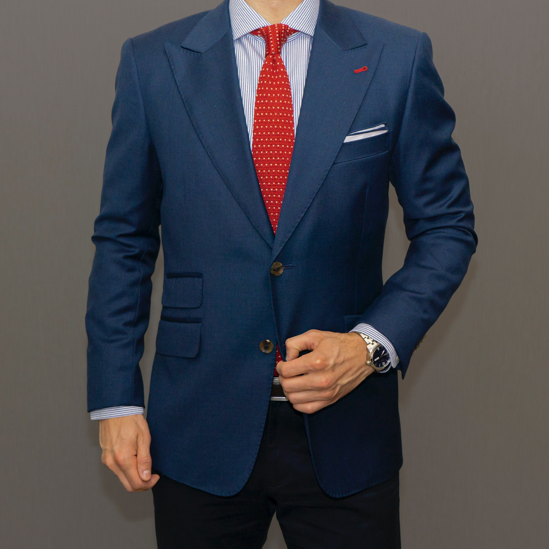
Photographical Elements


Typographical Elements
Final Hi-Fi Screens
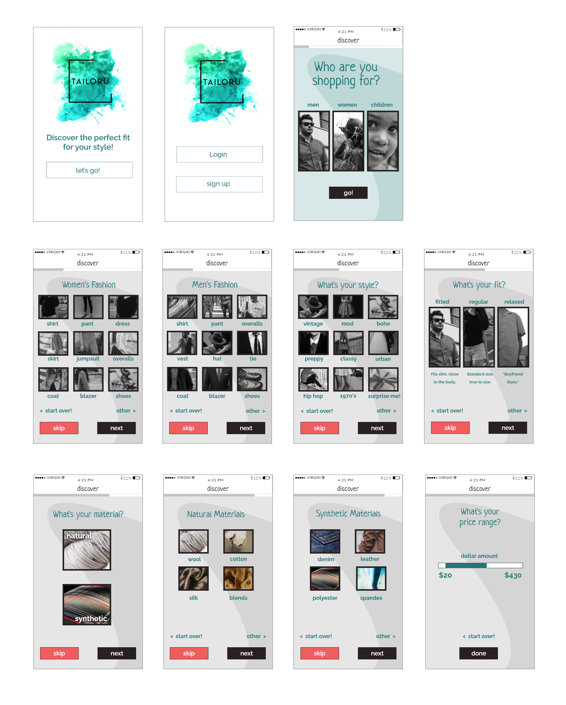
While the feedback was mostly positive with the second iteration of hi-fi screens, users did not think the black and white imagery worked well with the application. So, the photography was changed to color to better display the unique designs and options that the tailors could produce for customers. The background was also still distracting from its overall functionality. So, I toned the background down to a light muted grey. The font style was updated (Slick Slant) for readability. The font also portrayed a simple creative style. I implemented additional screens to assist in the user flow.